Developer Portal -
Achieve Inc.
A simplified and reorganized the global developer portal, user
interface, and employee-facing backend.
Description
About the project
Overview
Consulting is a unique experience defined by its challenges and opportunities. While you bring subject matter expertise to the table, you operate within the constraints of a statement of work, often with little say in its scope. Decisions ultimately rest with the client, no matter how strong your recommendations. However, consulting also provides the chance to work with diverse clients and products, collaborating with people at all levels of an organization.
On this project, I worked directly with vice presidents and lead architects, identifying critical issues and presenting solutions to problems they had not previously recognized. We identified key process changes and offered reworked user flows. This dynamic requires a balance of humility and confidence to address gaps and effectively guide stakeholders toward impactful change.
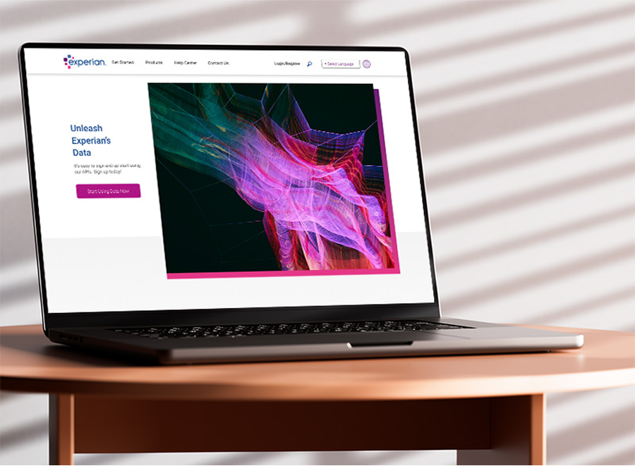
Experian wanted to make their data more accessible to external developers, enabling them to build apps and services. However, their developer portal was outdated, lacking a coherent story, a CMS, an organized process, or clear ownership. Over six months, including a fast-paced one-month discovery phase, I worked with stakeholders to uncover and explain the underlying issues developed from years of patchwork initiatives.
As the Senior Lead Product Designer, I simplified and reorganized the global developer portal's user experience, user interface, and employee-facing backend, making it capable of supporting their ambitious new goals. Despite the fast pace and complexity of the project, I ensured all groups stayed aligned and delivered a solution that met both business and user needs.
The Team & My Role
- Two VPs of Product, multiple business unit heads, multiple Lead Architects, and myself
- I led junior designers, filtering relevant information to them, refining ideas, and led brainstorming sessions
- Led all product and visual design efforts to get the product ready for launch
Goals & KPIs
- Launch the finished portal in 6 months (actual 7 months)
- Increase use of Experian data by external developers (internal Experian metrics)
- Simplify developer signup and login for both internal and external users. (100% accomplished)
Where We Started
We started from a place all product designers know too well: an outdated product burdened by years of neglect and accumulating design and technical debt. Addressing this debt quickly was necessary to align with the company's goals.
To tackle this, we spoke with as many stakeholders as possible to uncover all the problems and gaps in the process. Taking a holistic approach, we aimed to address as many issues as possible within the given timeframe and budget constraints.
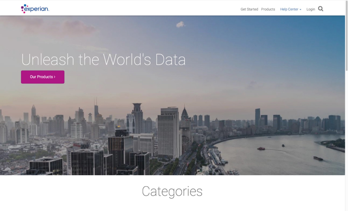
Their homepage neglected user experience and interface and had no cohesive story for users.
Strategy
Coordination between teams was integral to the project's success. The Experien team was large and consisted of many different business units worldwide, so communication was paramount. I had to make decisions quickly and clearly.
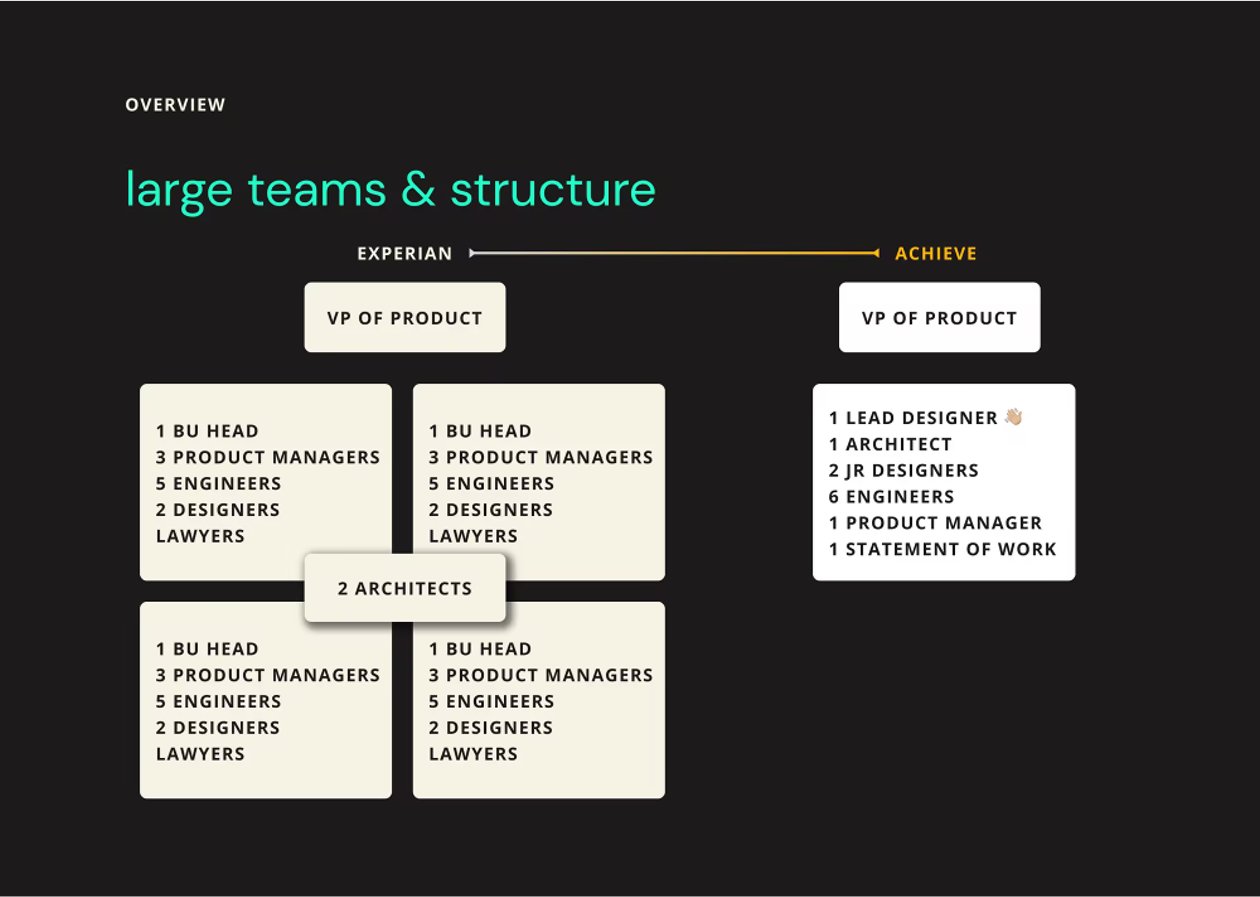
Large team, large team problems, lots of explicit communication was necessary.
Research & Fast Timelines
Due to time and budget constraints, exacerbated by COVID-19, we had to forgo formal user research, workshops, and testing. Rather than seeing this as a setback, we relied on fundamentals, experience, and best practices to guide decisions. We validated assumptions early through internal discussions, rapid iterations, and comparisons to industry standards, prioritizing usability over aesthetics. By leveraging mockups and prototypes for alignment, we streamlined decision-making and mitigated risks, ensuring we delivered a functional, user-centered product despite the challenges.
Approach, mockups, interaction, and the user experience
When I first joined the team, the standard process for presenting mockups involved delivering three options for every product or feature. While it seemed like a good way to offer flexibility, I quickly realized it was causing more harm than good. Multiple mockups inevitably led to more rounds of revisions, conflicting opinions, and delayed timelines. It became clear that what the team needed was clarity, decisiveness, and a streamlined approach. As this was a shorter engagement with multiple business units, there were too many cooks in the kitchen, all trying to decide on one project, and we were spinning our wheels on simple decisions.
I knew this wouldn't be an easy change. Offering multiple options felt safe to many stakeholders, who believed it gave them control. However, as the designer, it was my job to guide them toward the best path, not overwhelm them with choices. I needed to show that focusing on one substantial mockup wasn't just more efficient and better for the user and the company.
The turning point came when I demonstrated how consolidating ideas into a single, well-thought-out mockup could save significant time and improve outcomes. I explained how every additional mockup multiplied revisions, diluting the focus and creating unnecessary complexity. By presenting one solution with a clear rationale, we could align faster, make more confident decisions, and ensure our designs met user and business needs.
Mockups & Design by Committe
Offering multiple fully developed design options may seem helpful, but it often encourages "design by committee," where teams combine mismatched elements into a disjointed final product. As the designer, you've spoken with stakeholders and are trusted to have the answers. Focus on one well-thought-out design, and be prepared to justify your decisions. This approach builds trust, reduces revisions, and saves time for everyone. And as we had time constraints due to Covid, this was an easy sell to help get this project rolling and fast.
Trust as the Designer's Job
Earning trust was a critical part of this shift. My superiors entrusted me to refine the process because I showed I could think beyond pixels. I coordinated closely with junior designers to keep them from unnecessary meetings, instead giving them clear, high-level briefs. I made sure they understood what to do and why it mattered. I broke down decisions and shared context, fostering alignment within the team while keeping the workflow efficient.
When it came time to present the final designs to Experian, the trust I'd built became a cornerstone of success. Everyone, from stakeholders to junior designers, knew that our path wasn't just a design choice but a well-informed strategic decision. This confidence stemmed from our work to understand the underlying issues, align on goals, and simplify a complex and fragmented product. We created a solution rooted in user needs and business objectives by addressing key pain points, such as navigation challenges and inconsistent user flows. The decisions were backed by clear logic, leveraging proven design principles and aligning with the company's mission to support external developers. By advocating for this process and proving its value through thoughtful execution, we earned trust and delivered a solution that elevated the company's and its users' experience.
Design & Iterations
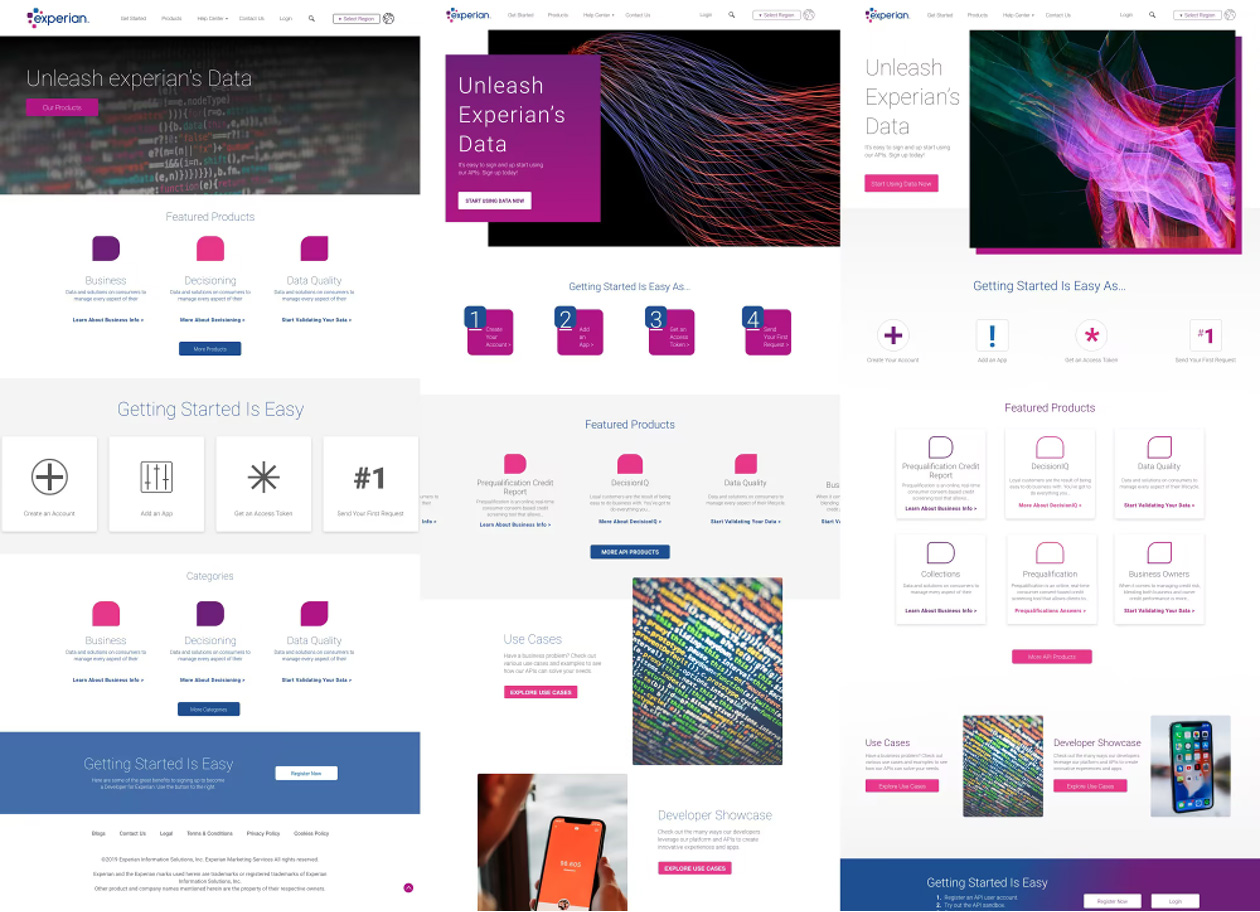
The initial internal mockups for the homepage and its various features.
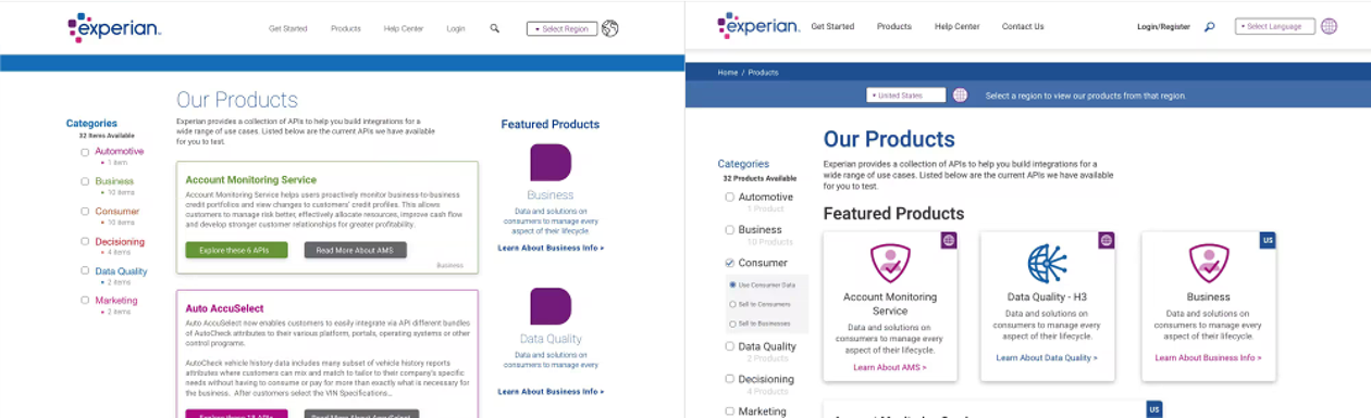
We made many iterations on the large and varied product catalog page, first experimenting with color and finally setting on cards with badges for the various offerings.
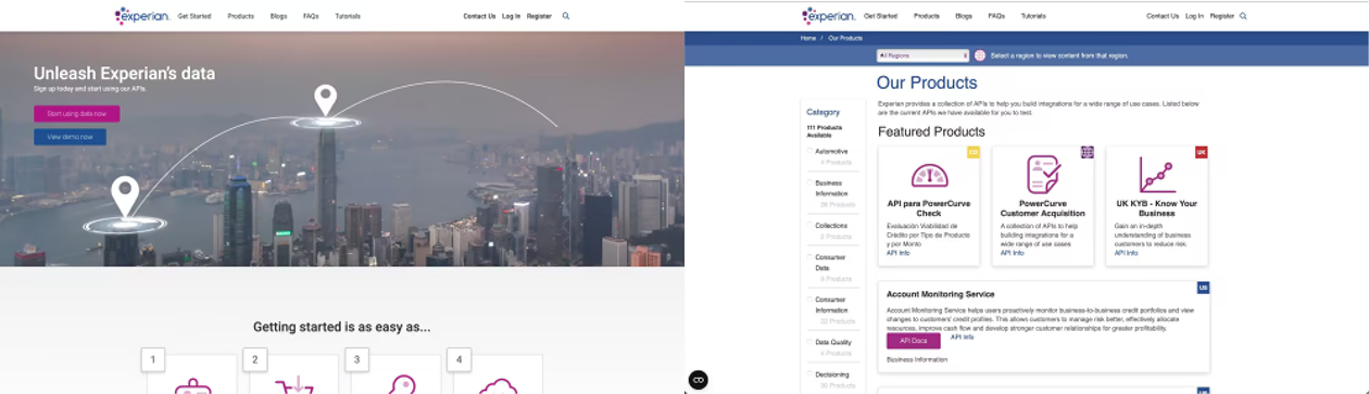
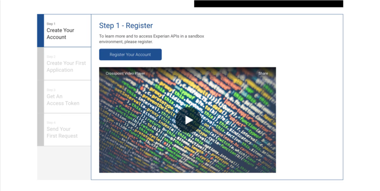
A quick and easy-to-navigate setup wizard was an often requested feature by the users. The team in charge of keeping the information up to date wanted a simple and most importantly easy to update on their end wizard.
The Results
Experian wanted to make its data more accessible to external developers, enabling them to build apps and services. However, its developer portal was outdated and lacked a coherent story, a CMS, an organized process, or clear ownership.
- Developers had one login to one platform to access all the products in the preferred language.
- New developers had an easy visual experience of creating new accounts.
- New developers could be auto-approved for accounts instead of waiting on Experian team members to approve access manually.
- Team members could easily update product copy and terms and conditions across regions. Through the Drupal CMS, they could also feature their products and blog posts on the homepage.
- Team members could easily find all user questions and feedback in one location in the CMS, allowing faster response times to all user questions.
- Experian could quickly spotlight individual developers on their dev portal homepage. This addition was a late ask from marketing, but due to the introduction of the CMS and its ability to easily update content, it was an easy win to produce.
Final Designs
Experian wanted to make its data more accessible to external developers, enabling them to build apps and services. However, its developer portal was outdated and lacked a coherent story, a CMS, an organized process, or clear ownership.
Key Takeaways
- As the outside designer on this project, I did not have the opportunity to question their new design system, which was actively under construction.
- We could have more thoroughly defined the page count's scope from the beginning, which would have helped prevent it from exploding throughout the project.
- However, it was a large contract with many other moving pieces outside the purview of product design, so concessions were made, such as increasing the page count, to keep them in a longer consulting agreement.
- When timelines are tight, many tasks I prefer to do in a smaller in-house team setting get cut.
- User research was the first thing to go.
- A lot of trust was placed in my gut, the process, and the design team while validating ideas internally whenever possible.
- Post-launch validation on a project with no follow-up showed that the site is still largely intact as initially designed.
- Dealing with a global pandemic certainly slowed timelines in a few places.
- We kept timelines on track and delivered the project on time by maintaining constant communication on deadlines and collaborating with Engineering to start on pieces as soon as they were approved.
Achieved Goals & KPIs
- In the end we launched the entire portal in 7 months, one month late is not bad considering a global pandemic happened in the middle of the project.
- Increase use of Experian data by external developers, while it’s hard to say, as these metrics weren’t shared with us, referring to the current site being very simliar to what the team and I designed, I am confident that we achieved those goals.
- Simplify developer signup and login for both internal and external users, this was 100% achieved, giving everyone much simpler tools and a process to service their users allowed for much faster onboarding and searching of available products to their users.
Final Details
Consulting Considerations
There were pieces and parts that I would have liked more built out. Button options, the forms system, and a more well-thought-out sorting design would have been more helpful.
I would have liked to use a wider layout from the beginning. There could have been more there, see Uber Dev site, etc., but with a tight timeline and other more pressing matters, not trying to reinvent the wheel was the name of the game. For example, the mobile version was not a priority for the initial launch.
On a positive note, the website as it is today is very simliar in layout and the overall theme to what I presented during our mad dash to finish, a testament to my processes and communication.